Grey Background for Headshots: How to Choose
The most common advice about a grey background for headshots gets the decision backwards: choose grey because it looks professional. Choose it because it keeps your face visible in the places you'll use an AI portrait. A shade that works behind dark hair and a white shirt can disappear behind silver hair or a matching jacket. With generative portraits, you don't need to commit first and fix it later. You can compare shades from the same personal photos, then publish the version that survives the smallest crop.
Why Grey Wins for AI Headshots
Grey is a dependable default, not a compliance colour. Its value in an AI headshot is practical: a quiet field gives viewers less to inspect before they reach your eyes and expression. It also avoids the stark boundary that pure white can create around dark hair and clothing.
Neutral portrait backgrounds grew out of the need for standardized, distraction-free identification images, not a universal rule that grey makes everyone look better. For professional AI portraits, borrow the visual discipline, not the assumption that a neutral background makes a generated image suitable for official use.
Official documents have their own rules: the United States passport standard calls for plain white or off-white, while UK digital-photo guidance permits a plain light-coloured background, and you must never submit a generated grey portrait as an identification photo.
Verander je professionele imago
Ontvang verbluffende AI-gegenereerde professionele headshots in minder dan een uur. Upload gewone selfies of groepsfoto's, kies uit meer dan 100 stijlen en wij maken honderden perfecte foto's die jouw beste ik weergeven.
Choose portability over decoration
A restrained grey makes it easier to reuse an AI portrait across different layouts:
- Profile circles: Keep distracting objects away from the face and the outer crop.
- Website banners: Leave usable negative space beside the subject.
- Directory tiles: Maintain a consistent field without inventing an office behind every employee.
For social channels that need more personality, PostSyncer's fresh profile picture styles can help you compare presentation ideas before generating alternatives. Keep the expression and crop intentional rather than asking the background to supply all the character.
Say a company needs portraits for forty staff, each appearing on LinkedIn, its website, and email signatures. Applying an agreed neutral in a generation batch avoids arranging matching physical settings for every employee. Our team process generates employees' headshots together, wherever they're located, so consistency doesn't depend on everyone attending the same session.
The shade table makes that reason concrete. Pick the row that protects hair and clothing, not just the swatch you like best.
Which Grey Shade Fits the Face
Grey shades for AI headshots by use
Treat these pairings as starting decisions, not personality science. Background colour doesn't reliably communicate the same thing to every viewer. Wonderstory's professional-background guide discusses the contextual nature of background choices, a useful counterweight to claims that a particular neutral is universally flattering.
Start with the most vulnerable edge
Choose for the feature most likely to disappear. If you have silver hair, don't begin with light grey because it's common on LinkedIn. Try mid grey or charcoal, then check whether your jacket still separates.
If you're wearing a grey suit, mid grey may be the wrong starting point even when your hair looks distinct. Ask the generator for a lighter field, or keep the background and change the jacket. Preserving the shoulders matters because the crop needs a recognizable outline, not just a floating face.
Light grey works well as a first candidate for dark or medium hair with navy clothing. Off-white offers a cleaner minimalist alternative, but it's unforgiving when the generator also gives you a pale shirt and bright hair highlights.
Use undertone without recolouring the person
Warm grey can support an approachable brief for a coach or healthcare professional. It shouldn't turn pale skin orange or make deeper skin look muddy. Tell the generator to keep the skin tone natural and apply warmth to the background only.
Cool grey can suit a restrained tech or finance profile. Reject the result if the face looks desaturated or blue. You're selecting a background, not applying a cool filter across the whole portrait.
A circular crop can remove the bright collar or shoulder that made a charcoal version work at full size. Reduced screen brightness can also hide a subtle boundary. That's why an attractive full-resolution preview isn't enough to approve a shade.
Generate several candidates from the same photo set and compare them together. Our workflow makes that comparison possible without organizing another session or rebuilding the portrait around a different setting.
Light Control and the Face-First Order
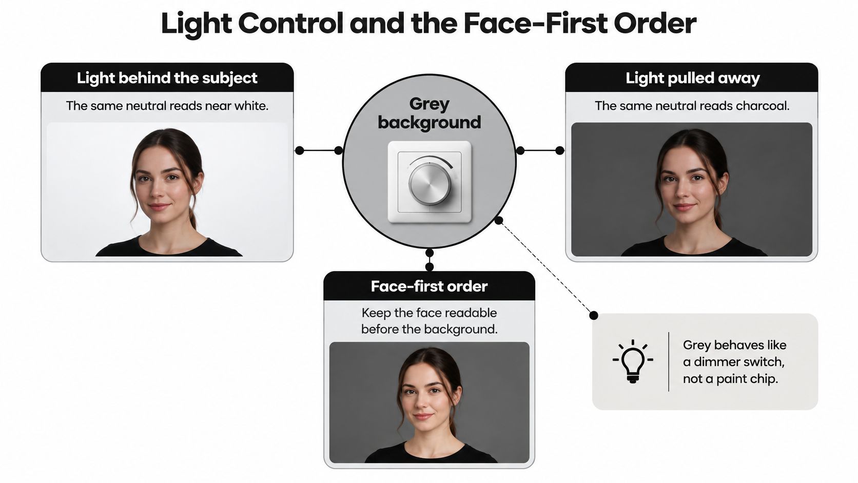
Think of generated grey as a dimmer switch, not a paint chip. The shade you name is only part of the result. The lighting description changes how bright, textured, and prominent that background appears.
Chronogram's guide to background colour and portrait lighting explains that more background illumination can make grey read near white, while less can make it read charcoal; directional illumination can also reveal texture. In an AI workflow, those are useful instructions for controlling the rendered scene rather than reasons to change your upload.
Set the face before changing the field
Approve a portrait with natural skin colour, readable eyes, and soft facial lighting before experimenting with background brightness. Our professional headshot lighting guide provides useful context for choosing that facial treatment.
Then make the edit narrow:
- Preserve the subject: Keep facial features, expression, hairstyle, and wardrobe unchanged.
- Adjust background brightness: Ask for a brighter or darker neutral field without changing facial exposure.
- Control texture: Specify a smooth, plain backdrop if the generated wall becomes mottled or distracting.
Say you're preparing portraits for a company biography, a contributed article, and an executive announcement. Use the same approved portrait as the basis for a bright corporate version, a moderate editorial version, and a darker executive version.
Compare them side by side. Don't select the brightest result automatically. Select the treatment that fits the layout while leaving the face believable.
Reject collateral changes
An instruction to darken the background can also produce darker skin, stronger facial shadows, or a different expression. Those are unwanted changes, not creative improvements. Return to the approved frame and make the background-only request more explicit.
The same applies to texture. A subtle wall effect may look polished in a large preview but resemble compression noise when reduced. Ask for an even field rather than repeatedly regenerating the entire scene.
Our editing workflow lets you refine that variable without starting the portrait process again. Grey earns its flexibility when the person stays fixed and only the background moves.
Industry Portraits That Benefit from Grey
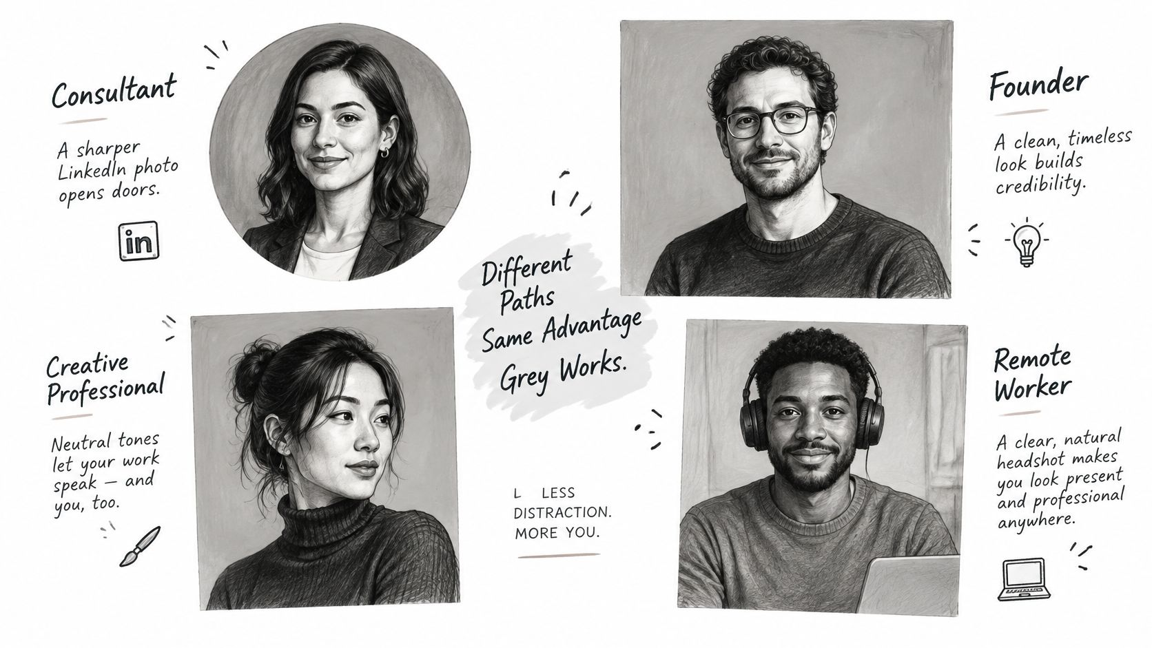
A consultant updates an AI-generated LinkedIn portrait before approaching new clients. The useful decision isn't whether the background looks impressive on its own. It's whether the face remains recognizable beside a headline, where the portrait occupies a small circle and competes with surrounding text.
A real-estate agent has a different distribution problem. The same portrait may sit beside a property listing, in a contact card, and beneath an email. A quiet grey lets the agent use a consistent image without introducing an invented house or office that viewers might mistake for a real location.
Different briefs, recognizable people
An actor can generate a charcoal portfolio portrait and a lighter commercial alternative from the same selfies. The background treatment can change, but facial structure, age, hairline, and identifying features shouldn't. Check submission rules before using generated images for casting, and don't let a polished result misrepresent current appearance.
A sales manager needs a coordinated website grid rather than individually dramatic portraits. An agreed grey and consistent lighting direction give the team a shared presentation, while each employee retains clothing that separates clearly. Our industry portrait use cases help connect those output choices to the places businesses publish them.
The practical distinction is:
- Consultants and coaches: Use a restrained expression and, where appropriate, warmer grey without adding a coloured scene.
- Finance professionals: Try cooler grey with natural skin rendering, not a cold cast across the face.
- Actors and performers: Keep identity faithful across contrasting portfolio treatments.
- Sales teams: Approve the grid as a group rather than choosing every image in isolation.
Know when grey adds nothing
Grey won't automatically make a portrait trustworthy, authoritative, or approachable. Expression, accurate likeness, clothing, and context still need to support the intended impression.
The operational advantage is simpler: the same personal-photo upload can support profile, website, and campaign variations without a separate production appointment for each channel. Our batch process lets teams review those uses together instead of managing disconnected portrait updates.
Drop grey when the brand system is intentionally colourful and a neutral portrait would look disconnected. If the requirement is an official document specifying white, leave the generative portrait workflow altogether and follow the document's photo requirements.
How to Generate a Grey Backdrop
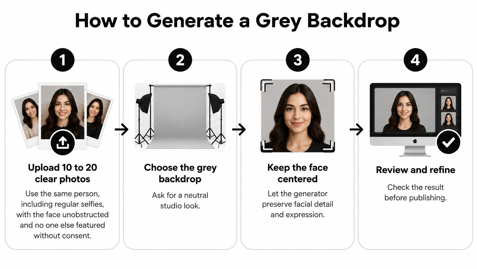
Make the background decision explicit before generating. A vague request for a professional portrait leaves too much room for invented offices, decorative walls, or a grey that clashes with the clothing.
Build and refine the portrait
- Upload 10 to 20 clear photos of yourself. Regular selfies are suitable. Keep your face unobstructed, use images that reflect your current appearance, and don't include other people without their consent. Clear inputs make it easier to judge whether the generated result represents you accurately.
- Select your gender and a professional visual direction, then name the shade. Use a description such as light neutral grey, smooth background, natural skin tone rather than studio grey alone. If you're creating performer portraits, epks, the electronic press kit builder, offers photo inspiration for your band's press kit that can help define the mood before you translate it into an individual AI-portrait brief.
- Choose the cleanest underlying frame. Inspect the eyes, hairline, ears, collar, and shoulders before judging the backdrop. Don't spend time refining a background behind an inaccurate likeness or malformed clothing.
- Edit the background brightness independently. Our guide to changing a photo background explains the background-editing approach. Keep the request focused on the field so the face doesn't get repainted during a tonal adjustment.
- Fix clothing clashes locally. If a jacket matches the wall, change the jacket in the editor instead of driving the grey toward an unsuitable extreme. This preserves the intended visual direction while solving the actual problem.
- Preview a circular crop and a small thumbnail before saving. Leave enough room around the head for the destination's crop, and check that the portrait still looks like you without relying on large-preview detail.
Preserve the publishing record
- Keep the original downloaded file and any machine-readable provenance information. Make background, jacket, and lighting edits on a copy. The European Commission's AI transparency guidance states that Article 50 obligations apply from 2 August 2026, including machine-readable marking of AI-generated content and visible disclosure requirements for qualifying deepfakes.
This sequence keeps generation, refinement, and publishing preparation in one manageable pass. You're replacing separate backdrop, reshoot, and retouch decisions with targeted edits, not skipping the review that makes the result usable.
Checks Before You Publish the Portrait
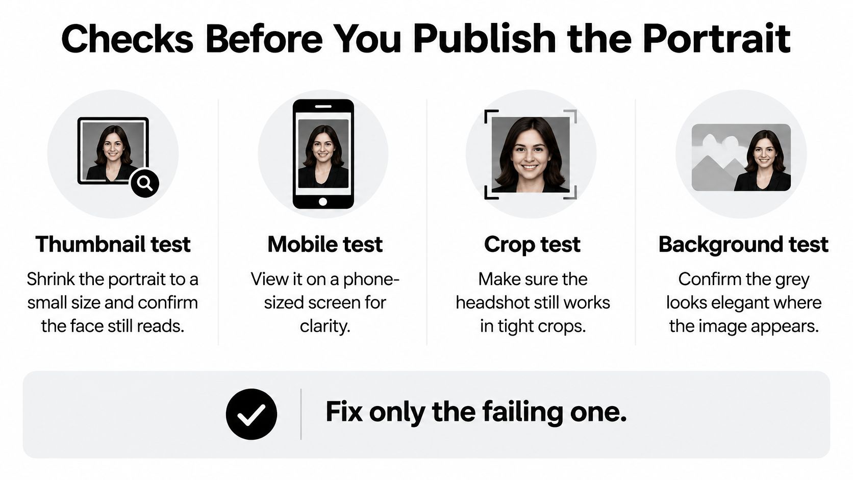
A grey that looks elegant in a large preview can fail in the places people encounter your headshot. Review the exported image, not just the generator's display, and fix the specific failure rather than restarting the whole portrait.
Run the visibility checklist
- Thumbnail test: Shrink the portrait to a LinkedIn-style circle and view it on a phone. If hair or shoulders disappear, nudge background luminance or choose clothing with a clearer boundary.
- Grayscale test: Temporarily remove colour. If the face and backdrop become an indistinct shape, choose a shade farther from the dominant hair or clothing tone.
- Theme test: Place the export on both white and dark pages. If the background feels too stark or too heavy in either context, try a mid-neutral treatment.
- Team test: Arrange representative employees in the actual directory layout. If the shared grey obscures an individual, refine that person's luminance or clothing while retaining the agreed neutral family.
For social-profile applications, Gainsty's guide to choosing an Instagram profile picture offers additional context for assessing the image as a profile asset rather than a standalone portrait. Use the destination's real crop whenever possible.
Checks, Failures and Fixes
Use contrast as a diagnostic, not a certificate
The W3C's non-text contrast guidance specifies a 3:1 minimum contrast ratio for applicable adjacent non-text graphical objects. Use that idea only as a practical benchmark when inspecting subject-background boundaries, not as a rule that certifies a portrait.
WCAG text-contrast rules don't certify portrait quality. A headshot contains gradients, texture, highlights, and shadows, so a single contrast measurement can't tell you whether someone remains recognizable.
Also reject clipped forehead highlights and skin that has shifted toward grey. Correct facial rendering separately from the backdrop rather than darkening the entire image.
Reviewing the batch together lets you catch exceptions before deployment. Our workflow keeps those corrections inside the portrait process instead of requiring another round of coordinated appointments.
Generate Your Grey Headshots Next
Lock the shade row, the clothing contrast, and the smallest publishing destination before opening the generator. Those decisions give you a useful approval standard. Without them, it's easy to choose a beautiful large portrait that doesn't work in your actual profile.
Start with our Gray Wall style when a soft grey wall and natural sunlight match the professional look you want. It's a specific visual starting point, not a promise that every face needs the same background brightness.
Take the shortest route to an approved set
- Choose the starting treatment. Use Gray Wall for that soft, naturally lit setting, then judge the result against your chosen shade and clothing combination.
- For a team, match the brand using favourite images or hex codes. Generate the group together so reviewers can assess the shared field and individual portraits in the same approval pass.
- Reject weak boundaries. Run the thumbnail check on the exported candidates and discard frames where hair or shoulders merge into the background.
- Publish the portrait that keeps the face first, with the right crop and a faithful likeness.
Our Special Offer promises AI-generated professional headshots in under an hour. Use that speed to compare and review deliberately, not to skip inspection. The goal is an approved portrait set, not a large gallery.
Finish with a usable publishing file
Keep the marked original and work from copies when preparing channel-specific versions. Add a visible disclosure where the public image falls within the applicable deepfake disclosure requirement.
You must be at least 18 and of legal age in your jurisdiction to generate professional headshots with us. Don't upload other people's photos without their consent.
Upload your personal photos, choose the grey that protects your hair and clothing, and generate your first set with Secta Labs. For a company refresh, establish the brand reference before inviting employees, then review the group together. Choose the portrait that remains clear at its smallest size and publish that frame, not merely the most dramatic preview.